The Anaheim Ducks are mighty once again. The team has unveiled their new look for the 2024-25 NHL season, and the reactions to the updated logo and branding have been mixed.
The Ducks have brought back the original Mighty Ducks Wild Wing logo- a change many fans have asked for over the years- with a new, fresh look. His face is meaner, his lines bolder, and the entire design has been refreshed to bring it into the modern day and usher in a new ear of Orange County hockey. Notably missing from this rebrand, much to many fans’ chagrin, is a return to the legacy colors of the hockey club. The orange, black, and gold color scheme the Ducks have been sporting since 2006 is here to stay, albeit in a slightly darker hue. The team has coined the term “Orange Country” and is heavily leaning into its roots in Orange County. In a statement to Daily Faceoff, Ducks vice president of marketing Merit Tully said, “We are distinctly not LA. We don’t want to be L.A.. We are not from L.A. We’re moving in a bold direction, and there’s a reason for it – we want to represent people who are underrepresented. We believe Orange County is underserved as a pro sports market.”
A tribute to our legacy, with eyes on the future.
— Anaheim Ducks (@AnaheimDucks) June 26, 2024
You're entering Orange Country. pic.twitter.com/oXF8lTV7Os
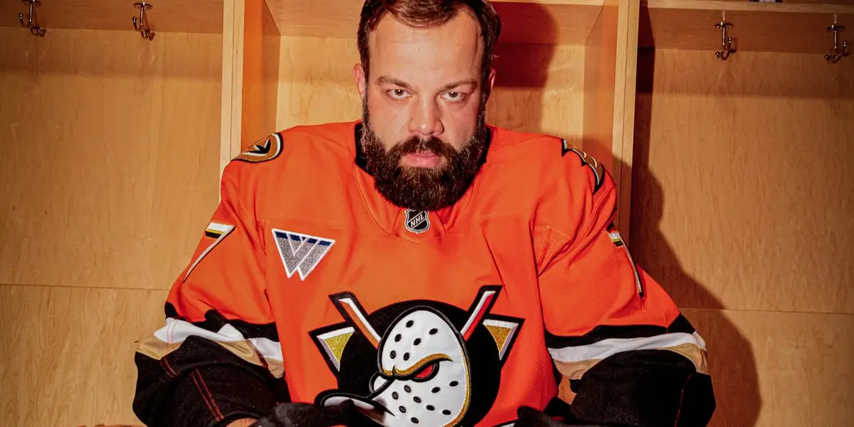
Alongside the logo launch, the Ducks also revealed their new jerseys. For their home look, the team will be sporting a monochromatic orange look, with orange buckets, sweaters, pants, and socks. The color is broken up by horizontal black and gold striping on the bottom of the sweater and diagonal striping on the sleeves, reminiscent of the legacy jersey worn when the team was owned by Disney. For away, they will sport white sweaters with an orange shoulder plate, orange diagonal striping on the sleeves, and orange horizontal striping on the bottom. These will be paired with white buckets, orange pants, and white socks. Both looks will feature a reworked version of the Ducks’ previous primary logo- the webbed D- which has also been reworked and updated to fit the new, modern direction of the brand.
While some fans are excited about the bold new update to Anaheim’s look, there are many still lamenting the color scheme, wishing for a swift return to the past. Others still are excited about the new change, especially after seeing the promotional video featuring Leo Carlsson, Radko Gudas, Trevor Zegras, Cam Fowler, and Troy Terry.
While the purple and jade Wild Wing remains an iconic symbol, both in the hockey sphere and general pop culture, the orange remains. Orange Country is not just a cute moniker for the club, it’s an indication of their desire to move hockey forward in Southern California and continue to nurture the market they have been building for 30 years. Love it or hate it, orange is here to stay.
The Summer Flock Party on Sunday, June 30 promises a first look a new merchandise, and fans will be able to see the new logo in action at the event. Online preorders will also start that day, so fans outside of the area will be able to rock the new logo soon.
It’s time to bring in a new era of Duck’s hockey. Let’s fly.
Episode 133: Mama, Im Quacking Home – Late Arrivals: An Anaheim Ducks Podcast
Discover more from Inside The Rink
Subscribe to get the latest posts sent to your email.


Love the new look! Go Orange County Ducks!