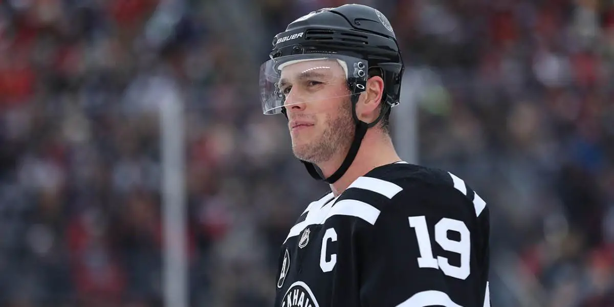
The Chicago Blackhawks are a historic franchise, an original six-team, and an organization that has been touted for having the best jerseys in the National Hockey League and the best jerseys in all sports. Chicago has had countless jerseys, from the many outdoor games they have played to the reverse retros that the NHL started this season. So let’s jump into the top 10 Chicago Blackhawks jerseys.
The only rule is that the jersey must be worn during a game or warmup.
(Now, I understand some people don’t love the Blackhawks logo as much as they once did; with that said, it is the current logo, and the discussion on the future of the logo is for another blog.)
Number 10.
2016 Stadium Series (VS Minnesota Wild)
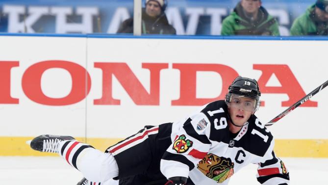
This is the only White outdoor jersey to make the top 10. This jersey just squeaked in because the Blackhawks finally changed the jersey in the slightest (The other white outdoor jerseys are very similar). With the 2016 Stadium series, the black shoulder was a nice change, but the best aspect of the jersey is the Chicago stars on the collar bone. Using the current logo instead of the old school logo was also a nice touch.
Number 9.
Green St. Patrick Day Plaid Warmup Jersey

Before you blow up my mentions, @CueTheDaggerPod, I understand the stigma around the green Blackhawks jerseys, and I was in the same boat that they were just awful foul things that shouldn’t be produced. Then I saw Toews in the green Plaid jersey with the no color logo in the middle and clover on the shoulder, and they are just fresh! If you don’t like these jerseys, again @CueTheDaggerPod
Number 8.
The Blackhawks Away Jersey
There’s not much to say about the Blackhawk’s away jersey; they have stayed about the same throughout history. I prefer the collar on the Reebok jersey, but the Addidas Jerseys are essentially the same. The black and red pop perfectly, and the logo steals the show on the away jersey.
Number 7.
Camo Blackhawks Warmup Jersey
You can choose any camo jerseys and put them in this slot; for me, the desert camo jerseys are just amazing. It could be my soft spot for the military and what they sacrifice, but these jerseys are cool. I wish they would wear them in-game, but I look forward to seeing them warm up in these.
Number 6.
1991-1992 NHL 75th Jersey
:format(jpeg)/cdn.vox-cdn.com/uploads/chorus_image/image/7272363/roenick-75th-jersey-600.0.jpg)
These jerseys have a lot going on, but it is just the right amount of clutter. The stripes catch the eye. I go to Roenick and his time with the Blackhawks when this jersey pops up. The Blackhawks have used this template more than once, and you could see another version of this jersey later on the list.
Number 5.
Black Third Jersey (the best version was 1996-1999)
/cdn.vox-cdn.com/uploads/chorus_asset/file/21993081/85619466.jpg.jpg)
It’s time for Chicago to bring back the black jerseys. The all-black background allows the beautiful coloring in the logo to shine. But, just a touch of red on the bottom and elbows makes this jersey clean. Plus, what is more intimidating than black jerseys? With the contact with Adidas coming up at the end of the season, we can hope the Blackhawks will get a third jersey with whatever company takes over.
Number 4.
2021 Reverse Retro
This is one jersey that Adidas just crushed a home run, bringing the black jersey back but improving on it with the additions of the red shoulders and more red at the base of the jersey enhanced on the all-black jersey that came in one spot before.
Number 3.
2019 Winter Classic
As mentioned before (During the NHL 75th), this jersey had a lot going on until they removed the red. Now red is my favorite color, but in this case, going just black and white calmed the jersey down to give you one of the cleanest, most intimidating jerseys you’ll ever see. This is the Dale Earnhardt of sports jerseys. The Blackhawks sometimes used this as a third jersey, but if you go back to the Winter Classic, they added a green patch to one shoulder, which looked fantastic.
Number 2.
Chicago Blackhawks Home Jersey
Not much has to be said here. Red and black are the best color combination paired with a gorgeous logo, and you got the best uniforms in all sports. Even though it comes in at two on my list, This is the best everyday uniform in sports. The jersey that comes in one spot ahead is better used as a third jersey. The way Blackhawks use other colors throughout the jersey does NOT get enough love. The nice touch of green and yellow on the shoulder adds to the jersey’s overall complexity. Even though over eight different colors are used throughout the jersey, the jersey is still simple.
Number 1.
2008 Winter Classic
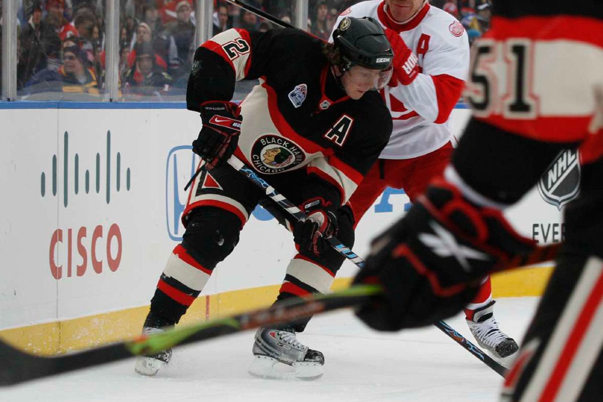
FIRE! These jerseys are perfection. The old school logo with the cream stripe throughout the middle of the jersey really brings out the “old school” vibe. Also, making the Numbers bigger than the cream was an excellent choice, making the numbers easy to see on the ice. Why have the Blackhawks not given Blackhawks fans the reverse retro of this jersey blows my mind. The game didn’t work out for the Blackhawks, but these jerseys were well worth the loss. This is the jersey the Blackhawks need to bring back as a third jersey. The red will always be the better jersey to wear normally, but pulling out the “old school” black and cream jerseys on a Saturday night versus the Blues would make the United Centers’ roof blow off!
Also, be sure to check out the podcast where we rank the top ten jerseys of ALL-TIME. Also, follow the podcast @CueTheDaggerPod and @Inside_The_Rink
Season 2 Episode 10: Is Patrick Kane The Greatest Blackhawks Player Of All Time – Cue The Dagger
- Season 2 Episode 10: Is Patrick Kane The Greatest Blackhawks Player Of All Time
- Season 2 Episode 9: Peter Laviolette III
- Season 2 Episode 8: Hossa Night, Early NHL awards, NHL talk and more
- Season 2 Episode 7: Is Toews back? Should Matthews have to fight? and much more!
- Season 2 Episode 6: Three Blackhawks trades, Chicago's hot start, around the NHL and more
Discover more from Inside The Rink
Subscribe to get the latest posts sent to your email.

