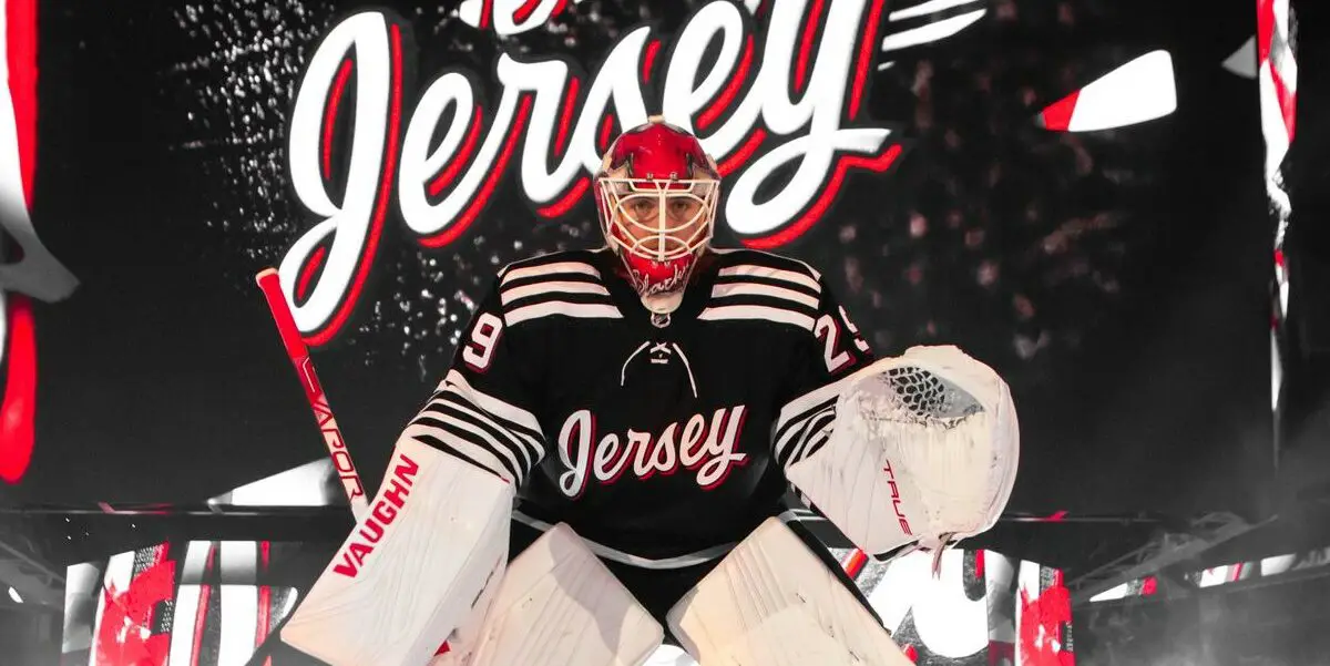
There has been significant chatter on the internet around the New Jersey Devil’s 3rd alternate jersey. The jersey is both genius and underwhelming at the same time, which might be the most impressive aspect of this entire thing. Here is precisely what the jersey looks like:
OK – I hear you. This sweater isn’t the prettiest jersey in the world, and yes, it does say the word jersey on it, but here’s the reason that’s genius, it has everyone talking. The NHL is currently focusing on growth mode, and the New Jersey Devils wanting to grow attention to their franchise, have done one thing no one else has; They have the entire internet, not just hockey fans, talking about their design.
The even more intelligent move by the Devils was putting franchise legend and Hall of Famers Marty Brodeur as the head of design on the jersey. No one, not even the biggest hockey fan, can genuinely question the design of Marty Brodeur and think they have ground to stand on.
The History
According to Jillian Frechette, the VP of Marketing and design team member, this project began over three years ago. It initially was an incredibly secret initiative with only a handful of team employees even knowing it was underway. The franchise understood the significance of putting out the team’s first third jersey in over 40 years, and they wanted to make sure it met all the hype that would come with that.
“We knew right from the get-go that we would lean into black, so that was easy,” Frechette said. “If you looked on social media, there was an intensity and a want among Devils fans, so this was very fan-focused.”
Once the jersey color was decided, the rest kind of fell into place, the idea of putting the word Jersey on the front was simple. According to both Frechette and Brodeur, the word Jersey is the “pride of the franchise.” Fans and team execs alike agree that being in New Jersey and part of the New Jersey community partially define their organization.
While the design seems underwhelming and rudimentary, it’s worth noting it also holds a significant amount of hockey history in it. The striping on the jersey is inspired by early pro hockey teams from the state. Teams with important hockey history like the Newark Bulldogs, Jersey Larks, and River Vale Skeeters. All of that mixed into the 21 stripes representing the state’s 21 counties. Regardless of how you feel about the design, you cannot say it wasn’t well thought out.
Bonus fact: The pattern around the lacing on the neck signifies a goalie net, just another proof point that Brodeur is as much part of the history of the franchise as he was a member of the design team.
Fan Reaction
While negativity and sarcasm are all part of being a hockey fan, it’s worth noting that fans are partially the reason this design ever came to be. “Other than a fourth Stanley Cup banner, this was the No. 2 question I got from fans,” said team president Jake Reynolds. “An anticipation for this has been bubbling. We’re modernizing the brand, and at the same time, we’re honoring our roots and legacy.”
That said, the fans might be asking, but here’s what they actually think of the end result:
Regardless of the fan reaction, the team will wear the jersey 13 times in its inaugural season as a nod to captain Nico Hischier. The debut game will be December 8th against the Philadelphia Flyers, with the second game being against the Detroit Red Wings on December 18th to commemorate the date of New Jersey first joining the union.
Discover more from Inside The Rink
Subscribe to get the latest posts sent to your email.


