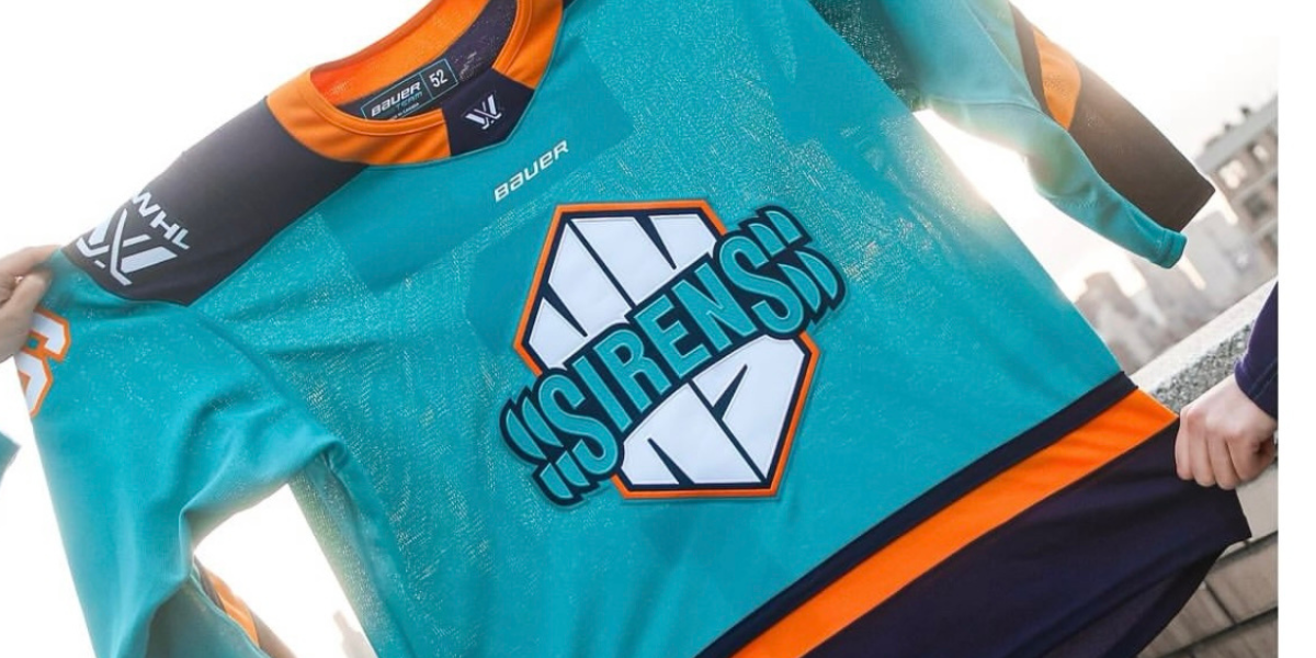
Thursday, November 7th, the PWHL took to social media to unveil the new jerseys for the 2024-25 season. This being the second season in the PWHL, the teams finally have their names and now jerseys that represent each team.
The Sirens took to their social media accounts to display their new jerseys loud and proud.
The new jerseys kept the original teal and dark blue from their inaugural season jerseys, but added the orange as an accent color. The orange truly helps the jerseys pop, as it outlines the logo in the center and the numbers of the players. The orange collar and the orange stripe at the bottom of the jersey is also a nice added touch.
The away jersey for the Sirens is white in the center and on the sleeves, yet has the orange, dark blue, and teal accents on the bottom of the jersey and the ends of the sleeves. It’s a fun added touch for the jersey to contain all the main colors of the home jersey, staying true to their roots.
The logo is front and center on the jersey, and the orange outline truly helps it pop. The NY in the center stands out on its own, but the outline helps draw the eye to it even more. The ripple effect in the S’s at the start and the end of the team name is also a nice added touch. The team name is derived from the goal horn, and the extra S’s help to add that echo effect you would hear from a real goal siren.
As the teams gear up to start training camp next week, it’s clear that the Sirens will have some nice new threads to help them get ready for the upcoming season.
Discover more from Inside The Rink
Subscribe to get the latest posts sent to your email.


Thanks for the nice read, Jess!