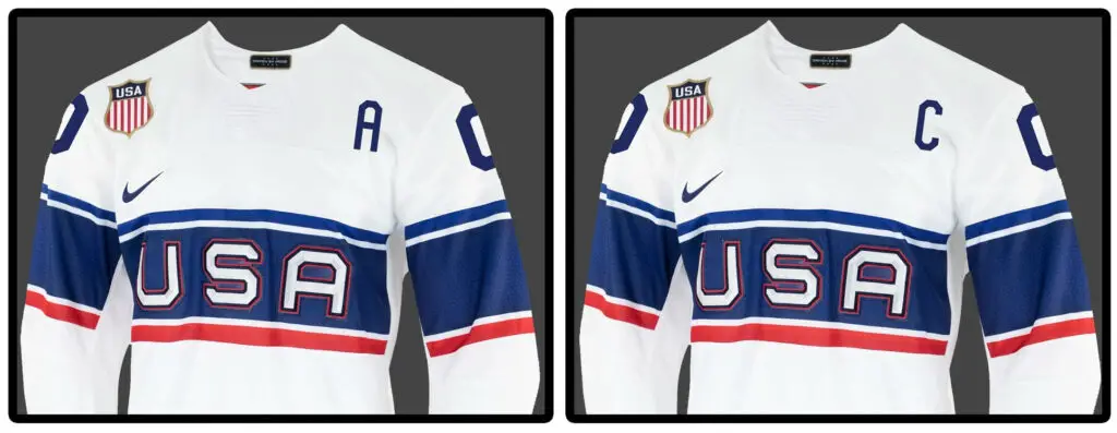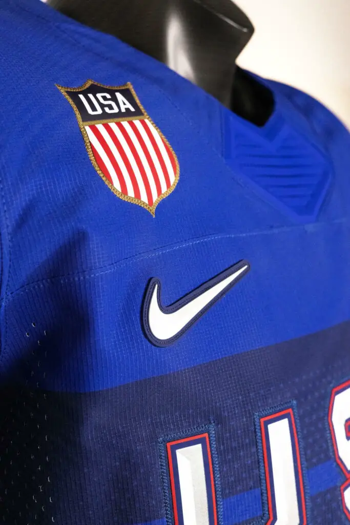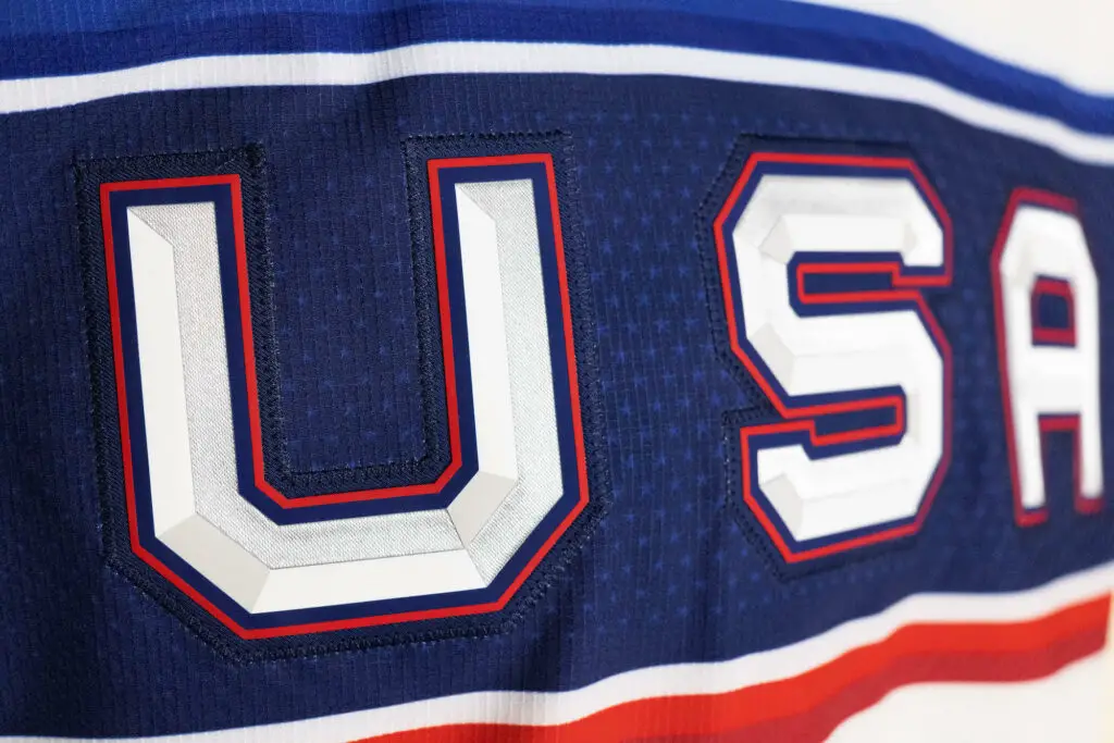
After sharing a teaser on Twitter around 4 pm yesterday, letting the fans know to keep their eyes peeled today at 10:00 EST, sure enough, at 10 am, they posted on time. Would it be safe to say they delivered? Well, that’s up to the fans.
Personally, in the hype video leading up to the final unveiling, I was a bit let down with the design choices. They decided to slap on “USA” as the chest piece instead of using other options such as the USA Hockey logo or the USA Hockey Shield that has already been incorporated in previous jerseys such as the 2018 and 2014 Winter Olympic jerseys. If you are detailed oriented like me, up close, the jerseys are phenomenal. Unfortunately, I feel that the Nike design team ONLY paid attention to detail and not the overall look. Coming from a Hockey and Soccer background, I have to say that these jerseys are very reminiscent of USA Soccer goalie jerseys, and to be quite frank, and I don’t think I like the combination of those two sports. Nevertheless, I believe the home and away jerseys are still pretty sharp, and I can see myself getting both (hopefully with McDonagh or McAvoy on it.) The lettering on the jersey is also graceful and minimalistic, especially on the home jersey, which adds a nice touch.


However, as much as these jerseys may be a bust compared to previous years, these jerseys do serve as a reminder that we are right around the corner from the Beijing Winter Olympics in February, and the excitement is only growing. Next up – reviewing the rosters when they are finally announced. Until then, feel free to comment below and let us know if you think these jerseys are a pass or fail or what your all-time favorite USA Hockey jersey is!
Discover more from Inside The Rink
Subscribe to get the latest posts sent to your email.


