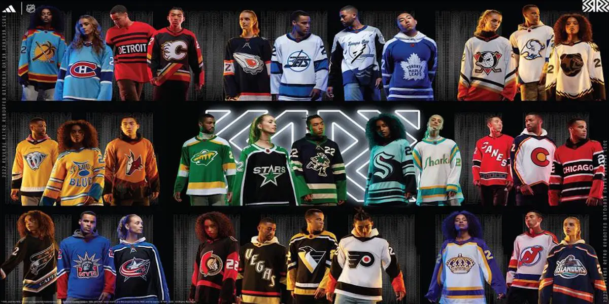
The NHL released their reverse retro jerseys last week, and while some teams have released some very nice ones, other teams could’ve done a lot better. I ranked them based on several things, including design, logo, overall look, theming of “reverse retro,” and creativity. Here is my ranking of all 32 Reverse Retro 2.0 Jerseys for this season.
32-27: Terrible, Horrible, No Good, Very Bad Jerseys
32 – Detriot Red Wings
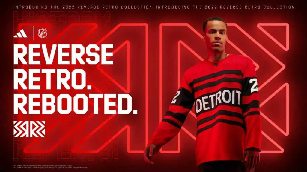
*Sigh*. Another year, another disappointing Reverse Retro from the Red Wings. I’m almost positive this is supposed to be based on their 1927-28 and 1929-30 jerseys, but it is an epic fail if that is what it’s supposed to be. No black exists in any Detroit Red Wings uniform, let alone that one. The black just looks wrong, and the black and red just don’t fit on this uniform. The design of the actual 1920s jersey is bad, to begin with, but it would still look more like a reverse retro if they simply swapped the colors. As much as I prefer dark jerseys without white, I would much rather have white than this monstrosity that the Red Wings call a jersey.
31 – St. Louis Blues
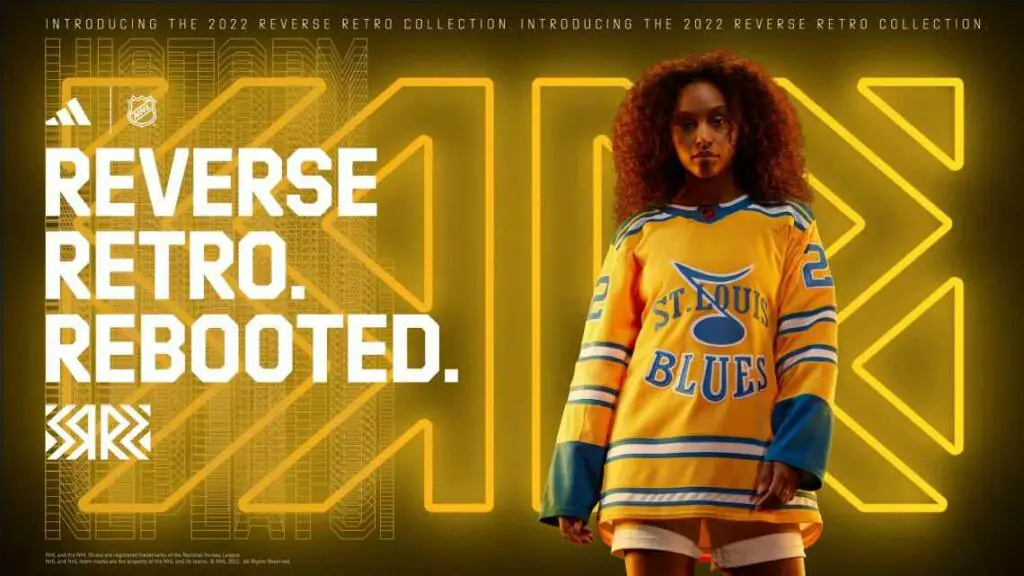
There’s a reason why this logo was never used. It should’ve been kept in the vault, in my honest opinion. The logo and most of the jersey are based on the Blues prototype jerseys from before their inaugural season, while some elements were from their Winter Classic uniform a year ago. It’s not more the jersey itself, but just the logo. It’s hideous. I hate it so much. I think it is one of the worst logos ever worn on an NHL jersey. However, the two stripes on the jersey also make his jersey ugly to me.
30 – Philadelphia Flyers
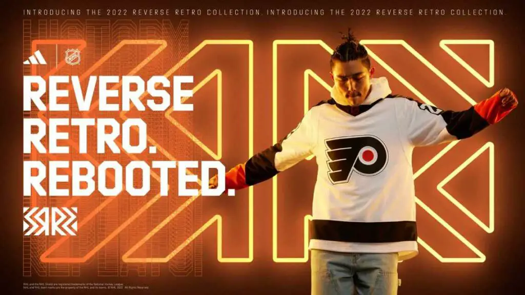
The jersey is made to honor the 1974-75 Stanley Cup Championship Flyers, while the slight orange on the sleeves represents the 1990s. It’s not the worst-looking jersey, but the jersey, to me, is just simply boring. The design is boring, and it just looks like a practice jersey that someone made in five minutes. Plus, they aren’t bringing the Cooperalls back for actual games, which brings them down in my book out of spite.
29 – Chicago Blackhawks
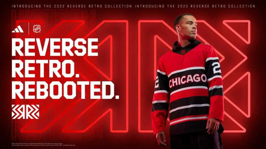
*insert Red Wings-Blackhawks “It’s the same picture” meme*. The only reason why the Blackhawks get a few spots ahead is that the colors and design at least fit an old Blackhawks jersey and the team’s history. To me, it looks just more natural and nicer saying “Chicago” than “Detriot.” Plus, black at least fits the Blackhawks’ color scheme. It’s still not good, though.
28 – Calgary Flames
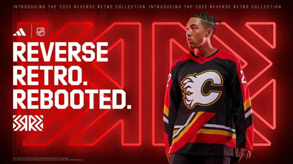
The Flames threw it back into the 90s Pedestal era with their jersey. Similar to the Penguins, this jersey brought some bad times. The design is the same as the original jersey, with the colors reversed. I never was a fan of this jersey design whatsoever. Although I think the reversed colors help make this jersey nicer, the plan is just wrong, in my opinion, especially with the “pillar” type lines on the bottom. I just never liked this jersey, and the reverse retro doesn’t do enough to change my mind.
27 – Vancouver Canucks
This will probably not be a popular choice, but let me explain. When I first saw this, my mind immediately went to the Sundin twins. First off, it made me think of the white “stick in rink” white throwback jersey that the Canucks wore in the early 2010s. Also, it could be that all jerseys have had a “22” on them since 2022. The logo and jersey are based on the 1962 “Johnny Canuck” from the WHL’s Vancouver Canucks (where the team got its name from). At first, I thought this jersey was pretty nice when I first saw the leak a few months ago, but the more I look at the whole jersey in a clean image, the more I hate it. The jersey design itself is just ugly to me. I don’t like the green or blue together, and I don’t like the Johnny Canuck logo as a primary logo. It just feels out of place for me on the jersey, and the numbers on the side (I understand why they did, as it helps give a 1960s feel) don’t make this jersey any better.
26-22: I dislike these jerseys
26 – Ottawa Senators

The jersey resembles the original “third” jersey Ottawa wore in 1997 and the jerseys the Senators wore on their run to the Stanley Cup Final in 2006-07. The jersey is mainly black, with red striping and the 2006-07 primary logo on the shoulders. Overall, this jersey feels somewhat bland to me. I feel like the Sens could’ve gone with another design or added another color on the striping or something. Overall, just too basic for my liking.
25 – Columbus Blue Jackets
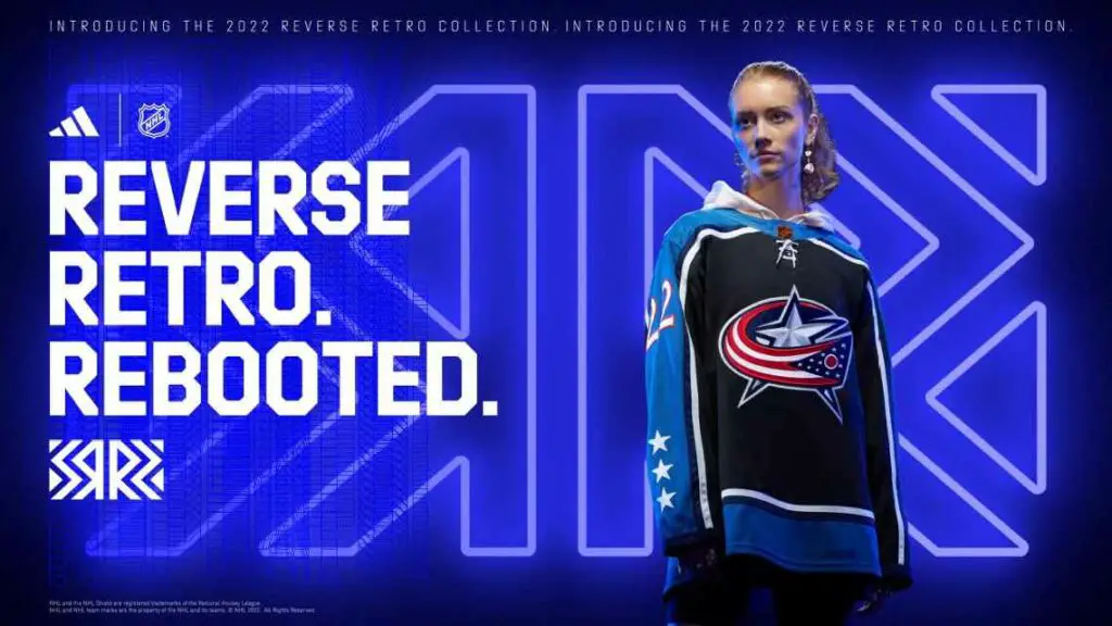
The jersey is based on the Blue Jackets’ original “third” jersey the team wore from 2003 to 2007. The colors are reversed. However, the blue on the sleeves is a lighter blue from the Blue Jackets’ current Alternate jersey rather than the dark navy blue used initially. Honestly, this jersey would be much higher on my list if they used navy blue rather than light blue for the sleeves. The light blue and black don’t go together, in my opinion. The design isn’t terrible, but not my favorite either. This Jersey is bad, in my opinion, but not horrible by any means.
24 – Carolina Hurricanes
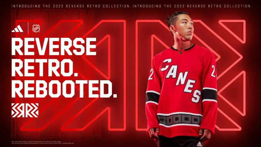
It’s a red and black version of their away jersey. It’s a “reverse,” but it’s sure as heck ain’t “retro.” However, the jersey looks pretty nice, and I like it as an alternate or even making it their home jersey. Still, because this is not a “retro” jersey, it’s going in the “bad” category.
23 – Colorado Avalanche
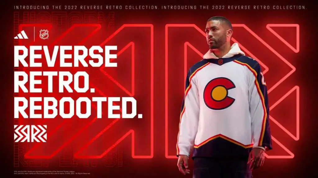
After having the best (not up for discussion) reverse retro originally, the Avalanche disappointed this time. The jersey design is based on the franchise’s inaugural season in Colorado (or their current jerseys), while the logo and color are based on the Colorado State Flag. I feel like they could’ve done a lot more here. They are already using their regular jerseys for the design, and the state flag and colors are creative but boring, in my opinion.
22 – Vegas Golden Knights
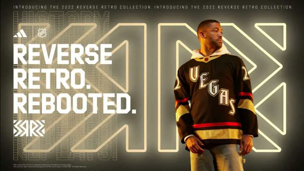
Their jersey pays homage to the Las Vegas Strip in the 90s. The “Vegas” font is based on the famed Excalibur Hotel, while the number font is from the renowned Stardust Hotel. The jersey itself is cool. It just doesn’t have any “reverse” to anything. As a retro jersey honoring Vegas, it’s very cool. But it’s “reverse retro.” I don’t see where “reverse” comes to play here. It gets bonus points because the jersey itself is decently nice, as well as its glow-in-the-dark ability, which is unique and very cool.
21-18: Eh, it could be worse, but it could be a lot better
21 – San Jose Sharks
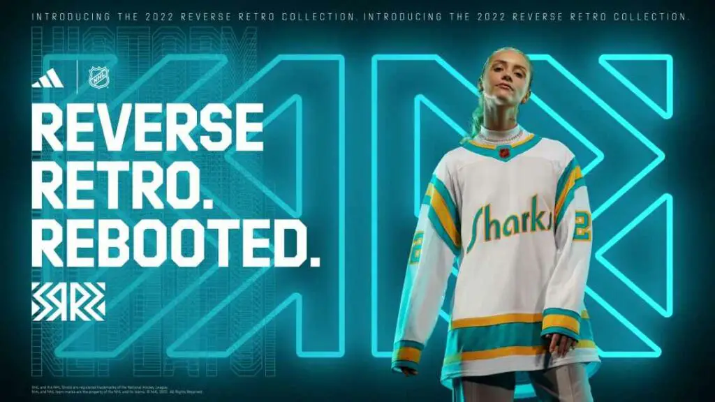
This is exactly the 1974-75 California Golden Seals jersey, but it says “Sharks” instead of “Seals” on the front. I have two reasons for putting it in this category. The first reason is that the jersey design is not my favorite in the first place, as it reminds me of a San Diego or Los Angeles Chargers jersey every time I look at it. Secondly, the Golden Seals doesn’t historically tie in with the Sharks. The Seals may have been the first team in the Bay Area, but this team has no history with the Sharks. The Golden Seals became the Cleveland Barons, Minnesota North Stars, and Dallas Stars. This would be higher on the list if the Stars used this throwback rather than the Sharks. Yeah, I’m being that picky. Deal with it.
20 – Montreal Canadiens
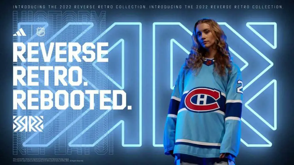
The jersey is inspired by the team’s success and the city’s style of the 1970s. Or they could call it a Montreal Expos-inspired jersey since that’s basically what it is. Either way, the only thing I don’t like about this is simply the light blue for the base. Swap the dark/navy blue and light blue; this jersey would be beautiful. Or change the design not to have any navy blue and just light blue and white, or maybe add some red instead. Either way, the blue on blue is too much on my eyes, but besides the colors, this jersey isn’t that bad.
19 – Toronto Maple Leafs
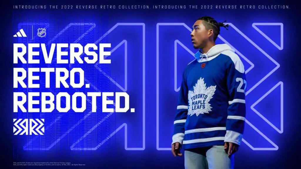
The jersey design is based on the team’s 2000s third jersey. The colors are reversed, and the arms’ striping is higher. The logo is supposed to look like the logo from 1940-1966. I don’t mind the design, but the logo is the only reason it’s down at 19. I don’t feel like the logo fits well into this design. I would’ve preferred a white version of the leaf design on the 2000s third jersey. A literal reverse of the 2000s third would’ve been more excellent than this.
18 – Seattle Kraken
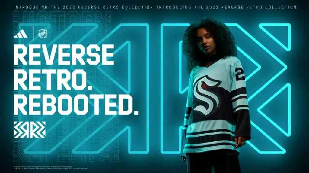
It was Seattle’s first “Krak” at the Reverse Retro, and they didn’t disappoint too much. The jersey honors the 1943-44 Northwest Industrial Hockey League team, the Seattle Ironmen. The jersey design is pretty accurate, with Seattle adding their colors and logo onto the jersey. With this only being their second season in existence, they don’t have anything they can throw back to of their own, so for this reason, I won’t be too hard on them. I put them low because I don’t really like the colors on the design and how they go together. I think having more of a creme color than navy blue would’ve made this jersey look a bit nicer. I’m judging the Kraken solely on looks here more than anything, but I will add that a Metropolitans throwback would’ve been nice too.
17-13: Not bad, Not Good, Just Right in the Middle
17 – Dallas Stars
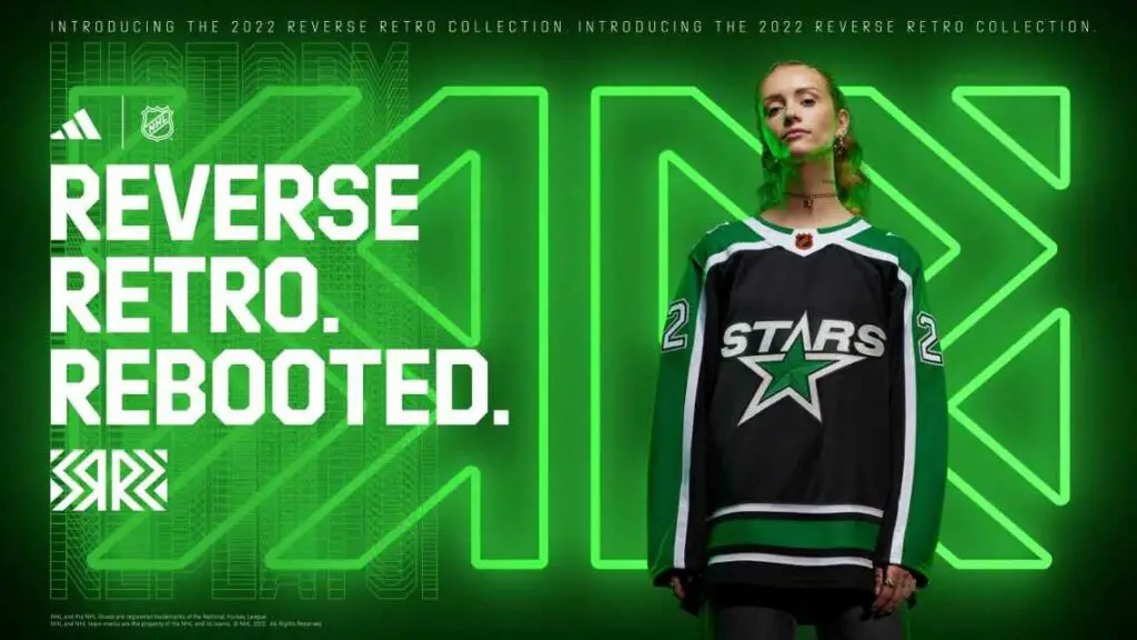
This jersey is based on their inaugural season jersey, which has the color scheme of the current jerseys. The thing I like about this is that they kept the black base and logo from it. They just added green on the shoulders and the sleeves and green striping on the bottom. Adding these changes made me shy away from it, however. The colors all fit together well, and the logo is cool. However, the green placement is the only negative thing I can find on it, and the design ruins it for me.
16 – Nashville Predators
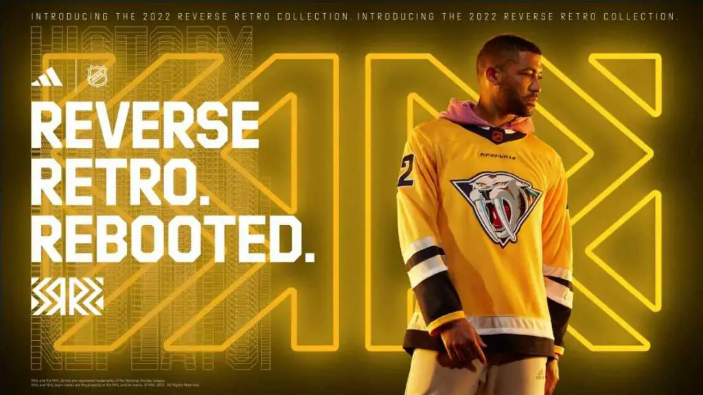
Mustard Cat is back, but with current Predators colors. I don’t mind the design. The logo is not my favorite, but it fits well on this design with the colors. The only thing I don’t like is the “NASHVILLE” between the collar and the logo. Besides that, I have nothing negative to say. As the kids say nowadays, this jersey is just “mid.”
15 – Edmonton Oilers
The jersey is almost the same third jersey the Oilers wore from 2001-2007. The only difference is that the team added some orange to make the jersey less gray. If truth be told, I’m still figuring out how I feel about this one. I don’t dislike anything about it whatsoever. However, it doesn’t look anything special to me, either. I always thought the original oil-drop jerseys were nothing special, and all they did was add a little bit of orange. That’s it.
14 – Minnesota Wild
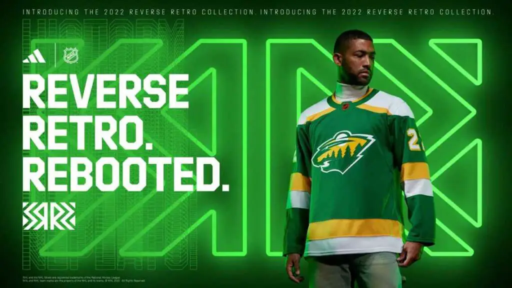
I am now hungry and don’t have food access as I write this section. I haven’t eaten at Subway in a while, and I’m honestly getting hungry while writing this. Either way, this jersey is a reverse of their reverse retro from two seasons ago. I don’t hate this jersey at all, but I loved the white jersey so much more. Either way, there’s not much more to say about this jersey.
13 – Winnipeg Jets
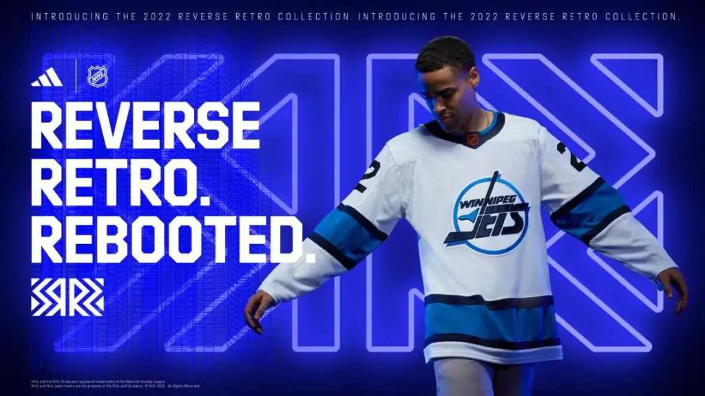
I don’t hate this jersey or design or anything at all. The jersey is based on their 1990s look, while the colors are primarily from their current alternate jersey. I don’t mind the jersey and the design, as this design and colors are already a billion times better than their original reverse retro jersey, and we haven’t seen them in action yet. The design is excellent, gives a nice retro feel, and the colors all match and look nice. The two different blues work together here nicely with this design. The reason why it’s low is that I wish that they would please throw it back to the Thrashers. Just once. That’s all I ask.
12-7: The Nice Ones
12 – Tampa Bay Lightning
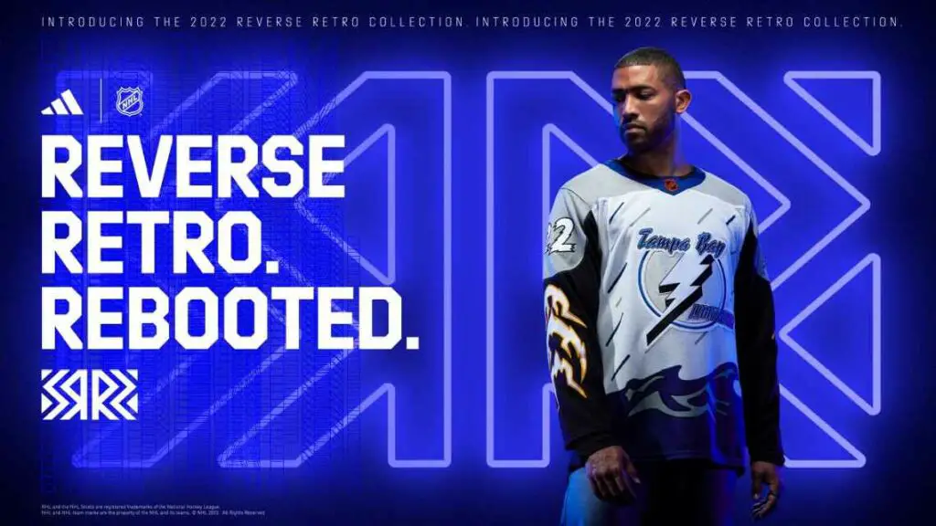
The Bolts are reversing it back to their original “Storm” jerseys from 1997. The jersey is the same, besides the base now being white instead of blue. Even though at first I didn’t, my mind changed. I like these. The design is pretty much the same, it’s an excellent design (although I prefer the blue over the white), and it’s just overall a cool jersey that wasn’t all fancied up with colors. I like it. Tampa did well with this, and I’m excited to see this jersey in action.
11 – New York Islanders
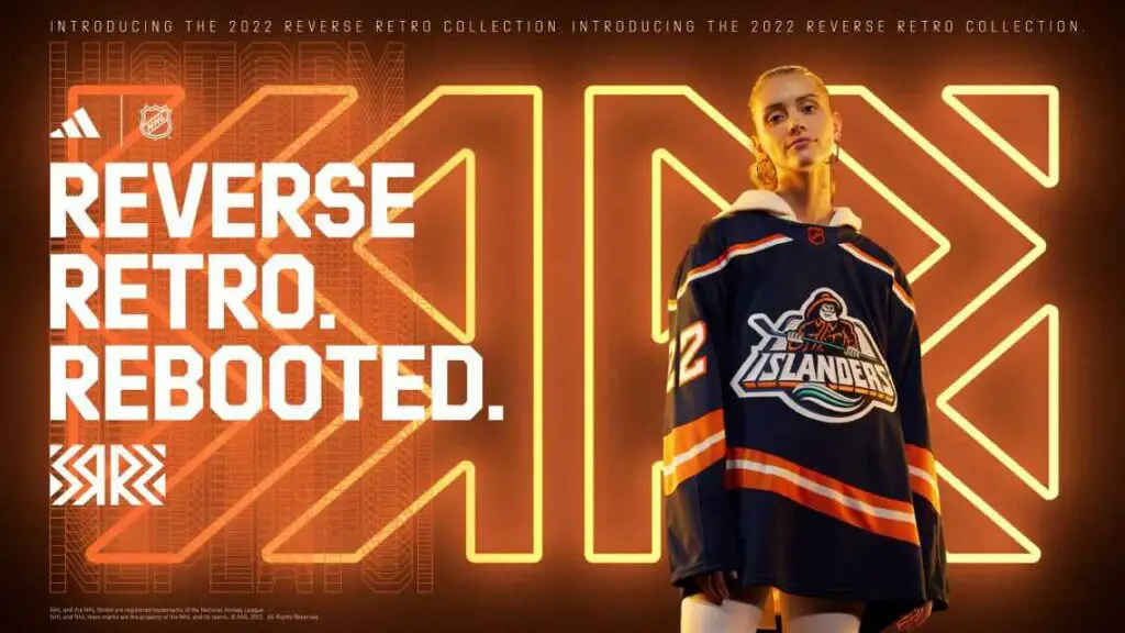
The Isles brought back the 90s fisherman for their reverse retro, but in a modern way. Although it wasn’t the exact jersey that all fans wanted, what we got is still pretty solid. The jersey is mostly navy, like the original, with orange and white trims. Teal is incorporated a tiny bit on the logo crest on the jersey, but that’s it. Either way, as much as I am disappointed that it wasn’t the original fisherman with the original swoop, or an orange or teal version of that (after all, it is called “reverse retro”), it’s still a pretty nice jersey, with a solid design, and a grand color scheme that matches well with each other. Getting it closer to the original would make me want to put this more into the top 10.
10 – New York Rangers
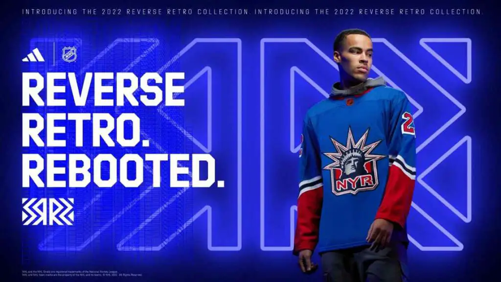
Our first team in the top 10 is the New York Rangers. They again went with the Lady Liberty design but updated it to the Rangers’ current blue and put red on the bottom of the sleeves. I like this a lot. While I think doing something else for a change would’ve been nice, the jersey looks pretty solid and lovely with the Rangers’ current color scheme. They kept the logo the same, which I like, and I think the red on the bottom of the sleeves completes the sleek look the Rangers went with here. I am happy with it, and I like it.
9 – New Jersey Devils
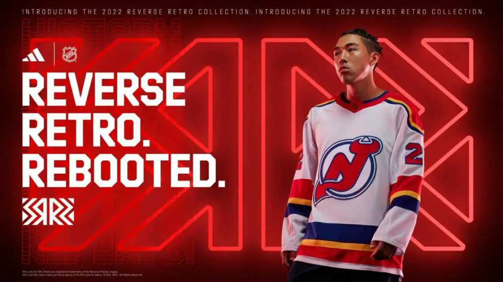
The Devils remixed their 1982 jersey from their inaugural season in N.J. while using the color scheme of the team they were before relocation, the Colorado Rockies. I like the jersey. In my opinion, the Devils 1982 design has been getting a little overused, but they found a unique way to use it. The colors work; they even went as far as matching the logo with the color scheme is excellent. I think it looks pretty sharp, and I’m excited to see these jerseys in action.
8 – Buffalo Sabres
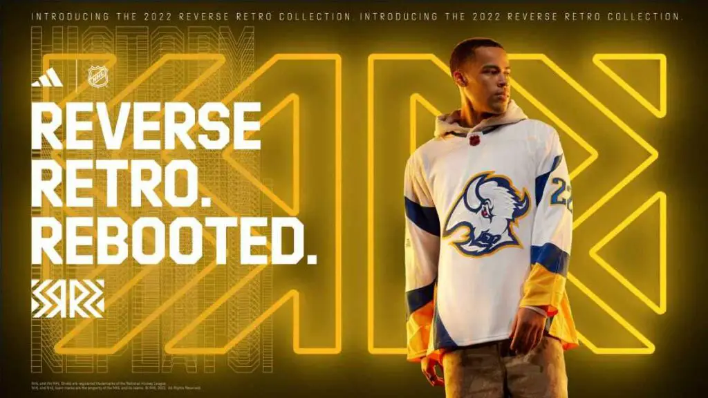
The Sabres will throw it back to 1996, wearing the “Buffalo Head” jersey. They’re already bringing back the black jersey for a throwback this year, so they decided to add the white jersey without the black and red but rather with the current blue and gold colors. I think the jersey looks pretty sweet. As much as I would’ve preferred something different since they’re already bringing back the original jersey, I still believe this is a slick jersey. The white, blue, and gold work well together, and the jersey gives a nice throwback feel. Plus, they did the same as the Devils and recolored the logo to match the colors. The Sabres did well on this one.
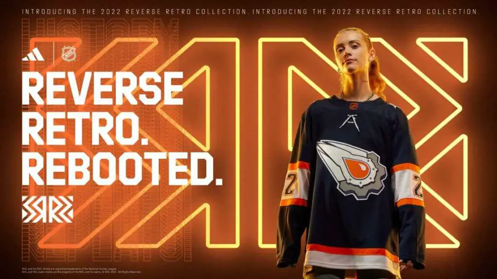
7 – Arizona Coyotes
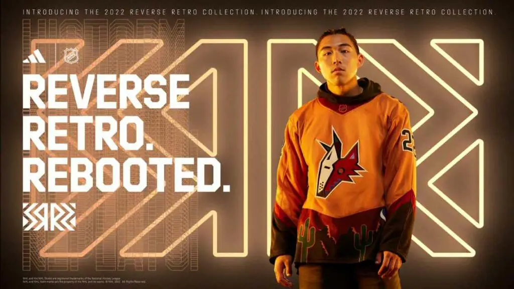
The Arizona Coyotes are now two for two on making beautiful and creative reverse retros. First, the beautiful purple ones, now beautiful orange ones. The 1998-2003 jersey inspired the look but was recolored to look like a desert. The classic Kachina logo is up front, with a base of sienna. The color then drops into a brown skyline with some green cacti on the bottom of it. On the right side, under the arm, is the Yotes’ famous moon logo, whereas a gecko is on both shoulders for the shoulder patch. The jersey is similar to the Yotes’ original reverse retro, but with the colors swapped and purple replacing the red. All in all, it’s very creative and sleek, nails the “reverse retro” namesake and is a beautiful jersey. Now, if only the Yotes could play as well as they could make great jerseys.
6-3: Awesome, Amazing, and Beautiful
6 – Los Angeles Kings
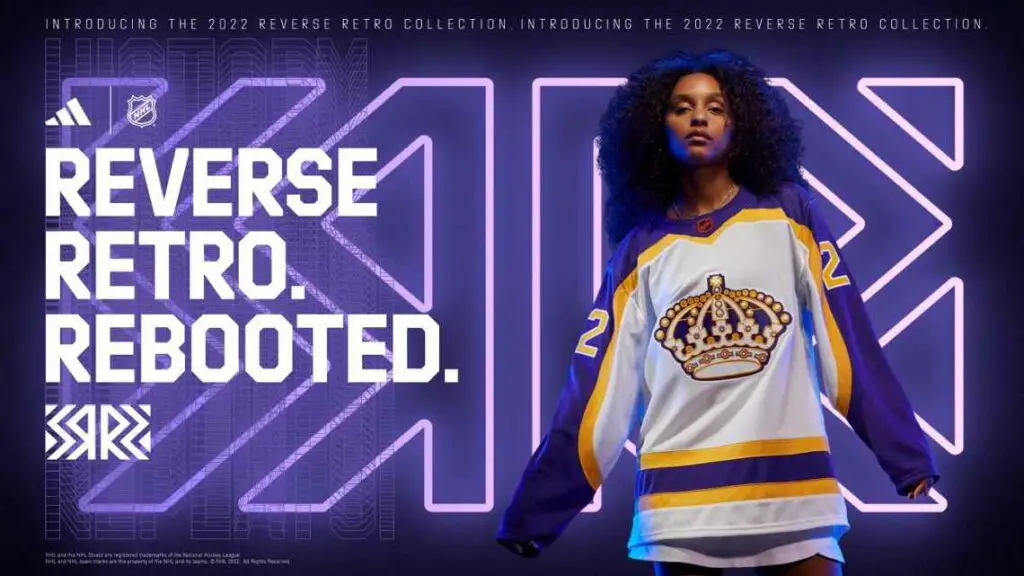
The LA Kings threw it back to 1982 and reversed the retro with this one. For the first time, they made one of their famed purple and gold jerseys have a white base. They nailed the design, throwback feel, colors, everything. They brought back the beautiful logo and original font. The purple and yellow look fantastic on a white base jersey, and the jersey as a whole looks beautiful. It looks so sleek and nice. I think this jersey won’t get as much love as it should from NHL fans. Either way, the jersey looks sick. I can’t wait to see these on ice.
5 – Anaheim Ducks
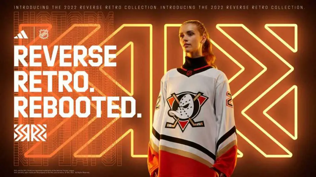
The Ducks bring back the 1993 Mighty Ducks jerseys with their current colors, which look incredible. It’s bold, seems so sweet, and I am excited to see this on the ice. The Mighty Duck logo with the orange looks so nice with a white base, and it fits the jersey so well. The Ducks nailed this by bringing it back. It could also be this far up because it looks much better than their ugly ones (I said what I said) from two years ago. It just looks so clean to me. I love them.
4 – Boston Bruins
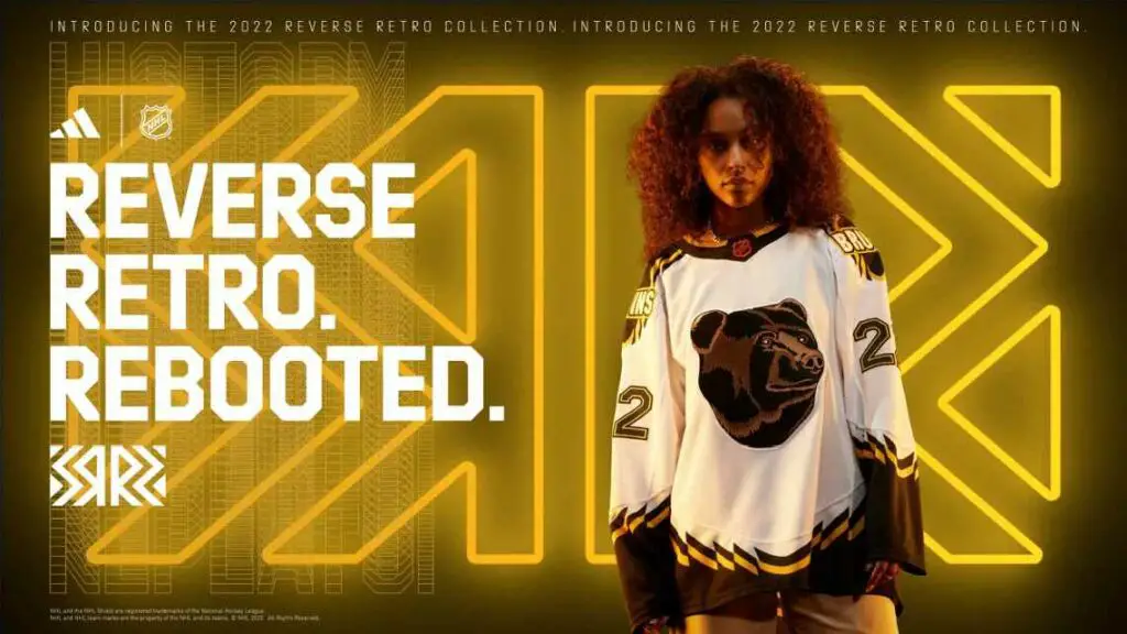
The 1995 “Pooh Bear,” third jersey, as called by Bruins fans, returns for their reverse retro. The jersey is relatively the same, besides the base being reversed to white instead of gold. I like it. I’ve always loved the unique design and logo so much. Being back in white makes this jersey look so much better to me. It looks so good in white, and I love it. I love the big, bold “BRUINS” on the shoulders, and just the zigzag design on the sides and shoulders looks so lovely, and the colors they used help signify the look. It looks so cool, and I love it.
3 – Pittsburgh Penguins
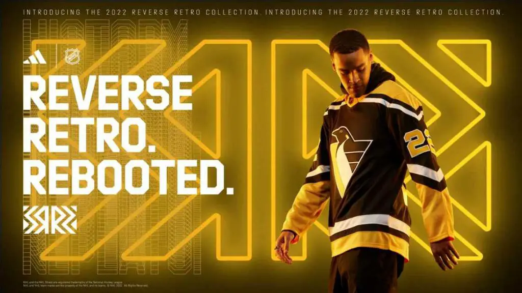
I can promise you I’m not being biased whatsoever (ok, maybe a tiny bit), but seriously, how is this not top five at most? The 1992-93 “RoboPen” is back, and it’s beautiful. The design is fantastic. The colors all look great, the RoboPen logo is one of the best logos in NHL history (yeah, I said it), and it all just seems so clean and cool. The jersey does not have V-shaped shoulders but rather gold-yolk shoulders that give it modernity. The only downside is that it doesn’t have the gradient line the original had gone across behind the logo. If that were added to this jersey, then it would be a serious candidate for number one, in my opinion. Either way, I love this jersey, its boldness, and sleekness, and I want one for my own.
2-1: Perfect. In Love, Grand Slam
2 – Washington Capitals
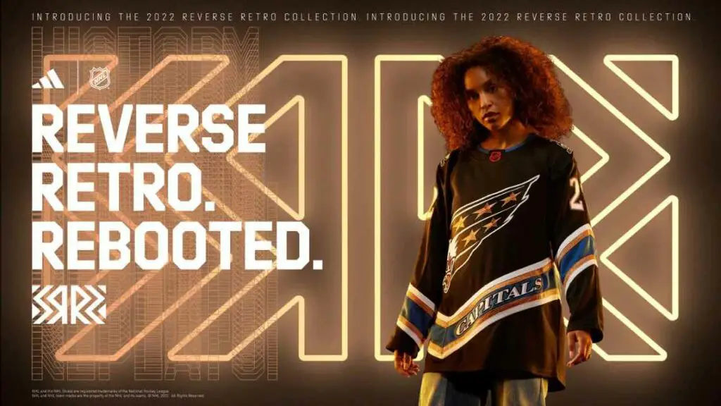
This jersey is a black version of their 1995 white screaming eagle jersey, or a combination of their browU.S.S. Capitol jersey and their screaming white eagle, if you want to be exact. I can’t say enough that I love it for so many reasons, and I’m a diehard Pens fan living in Pittsburgh, and I don’t say “I love it” to ANYTHING Caps related. This jersey, though, is so unique. It checks off all my boxes. Design? Beautiful! Logo? One of the best! Overall look? Sweet, bold, beautiful, amazing, all of the above. Theme? It nails the “reverse” as it pretty much swaps the white for the black base of the Capitol jersey, and it’s a “retro” jersey. It’s creative, too, with the whole “two jerseys into one” type deal, and I love it. I, without a doubt, can say that it’s one of the best.
1 – Florida Panthers
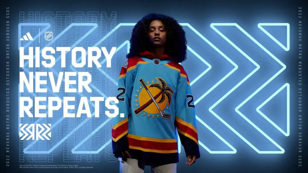
It’s hard to beat that Capitals jersey, but that Panthers one. Oh my gosh. Immediately it grabbed my attention when I saw it, and I still can’t look away. It’s their classic 1998 jersey with some bold Florida colors. They used the amazing sun, palm tree, and stick logo for the crest, which is the shoulder patch of the 1998 jersey, while using the 2009 alternate jersey’s light blue base as the base for this jersey (although the reverse retro is more light blue than even the sleeves that jersey), and then used their current red, yellow, and navy for the rest of the jersey. What can I say, except it’s mesmerizing and eye-popping! The design of the jersey is spot on to 1998. The logo? Finally, it’s time for the jersey crest, as it should, as I love this logo. It looks just colorful and bold and oozes Florida to me. The theme? It’s “retro,” as it goes back to 1998 with pretty much the exact design. The “reverse” comes in with the logo rather than the colors, as almost all teams did. The Panthers made the shoulder patch the main logo instead of bringing back the same logo they used last time. I find this very creative and unique; as they’re the only team to reverse the actual logos (prominent crest and shoulder patches) on the uniform, it is based on rather than the colors. However, the Panthers decided to eliminate the panther logo for this jersey and have two different shoulder patches instead, which I think is a unique and cool idea. In my opinion, Florida brought a nostalgic jersey that speaks “Florida,” and whoever designed this deserves a significant raise. Awesome job!
Anyway, that is the end of my list. While I may like one thing about a jersey, another thing can ruin it for me. While most only had 1-3 things that they could’ve done better for me to rank them higher, other teams completely missed it this year. Either way, I can’t wait to see these on the ice, and I hope the NHL brings this program back in a few years with whoever the new jersey supplier is.
Stanley Cup Aspirations – Cue’ the Duck Boats Pod
Discover more from Inside The Rink
Subscribe to get the latest posts sent to your email.