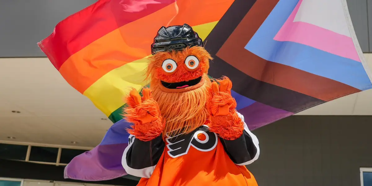
June is recognized as Pride Month to not only commemorate the 1969 Stonewall Uprising that was a catalyst for the LGBTQ+ movement, but continues to serve as visibility and a way for the community to celebrate one another while uplifting important issues that continue to surround the community today.
The NHL’s Hockey is for Everyone program was created to use the league’s influence to drive positive social change and foster more inclusive communities. The program celebrates all hockey programs, from the professionals down to youth organizations, providing a safe space for everyone regardless of one’s background.
All 32 teams hosted Pride-themed nights this season, and some went ahead and still made new themed jerseys despite the new leaguewide ban on wearing specialty, community-based jerseys during warmups, which players could wear while entering the building for the game and then auctioned off to raise funds for the team’s charity of choice.
Over the years, most teams have just integrated the rainbow onto their logos, but a few teams went out of their way to commission or create some remarkable jerseys. Here is my ranking of my top ten favorite Pride Jerseys.
Before I get started, I just wanted to give an honorable mention to all the teams that created and commissioned unique specialty jerseys and collections for Pride Night over the years and to all the incredible queer designers that helped make these nights that much more special for our community.
10. 2023-24 Montreal Canadiens by Isadora Ayesha
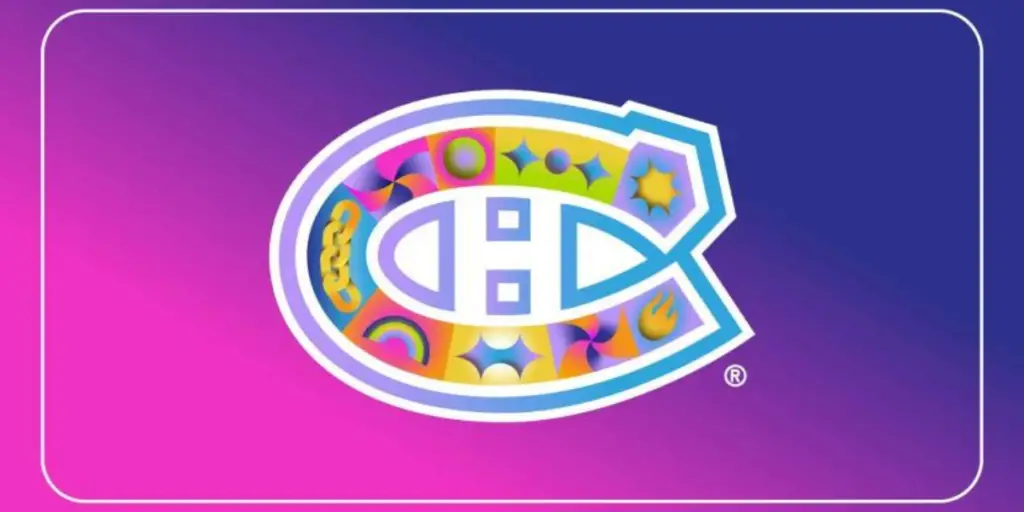
The Canadiens worked with Isadora Ayesha for this year’s Pride Night. Ayesha wanted to blend in iconic symbols of the queer community, while not being too on the nose with its references. The pallet is bright and colorful, not completely rainbow in its style as traditional pride jerseys usually are. Each symbol within the iconic logo represents a piece of queer culture from the classic rainbow which represents diversity and the fight for equality to the chain which represents solidarity and unity within the community. It’s a beautiful and unique take on the prompt.
9. 2023-24 Carolina Hurricanes by Chelsea Amato
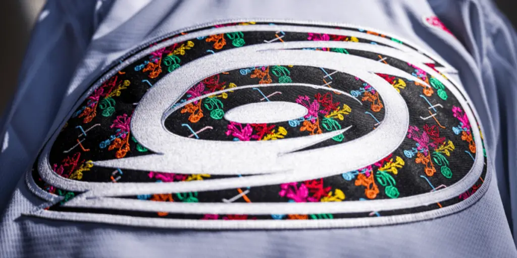
Chelsea Amato’s jersey takes a closer look to find its true meaning. Amato’s art specialty is in plants, healing, sustainability, resistance, and liberation. They were inspired by plants and their inherent queerness a representation of themselves and the queer community. This beautiful floral design fits perfectly into the Hurricanes logo, using violets, roses, Queen Anne’s Lace, poppy, lilies, and carnations. It’s a beautiful jersey that finds more meaning through with and through the queer experience.
8. 2022-23 Florida Panthers by Teepop
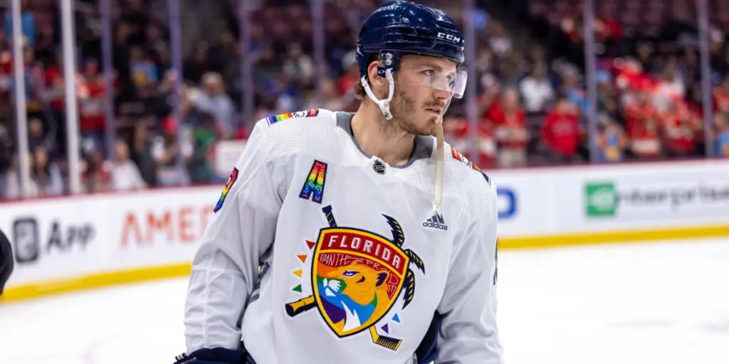
This next jersey worn by the Panthers wasn’t going to make this list at first glance. Without further investigation, this piece is just the classic Florida Panthers logo with rainbow patches and a few hints of extra color, but looking deeper reveals so much more. You can see Teepop’s signature squiggles within the player number patches as well as on the panther’s yellow coat, something Teepop likes to represent texture and movement, which also evokes Keith Haring’s famous pop art pieces that advocated for safe sex and AIDS awareness. It’s a beautiful jersey with so much detail, awareness, and love of the queer community.
7. 2023-24 Vancouver Canucks by Mio Linzie
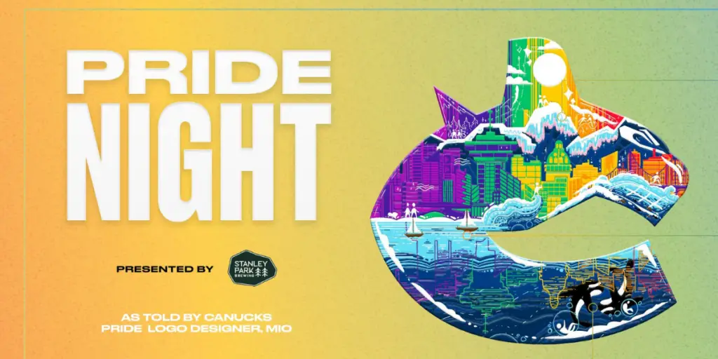
This is the first jersey designed by the incredible Mio Linzie on this list. Mio has become a hot commodity around the league in Pride Night designs and this was their latest collaboration with the Vancouver Canucks. Mio’s last design focused more on the nature of Vancouver, but this one displays the beautiful city skyline, wanting to show the many stories of queer individuals who live there. Each detail is given meaning, and there are so many details to find in this piece.
6. 2023-24 Florida Panthers by Enrique Cirino
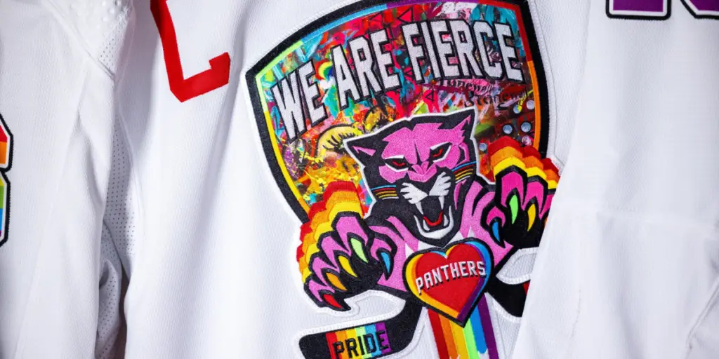
The Florida Panthers unveiled this beauty to celebrate this season’s Pride Night. Enrique Cirino’s chaotic graffiti design on top of the old Panthers logo is branded with the words “We are fierce.” This design has so many details throughout that make any queer person smile at the thoughtfulness and intentionality of the piece. It’s chaos and yet it all works in harmony, something that is very much part of the queer experience.
5. 2022-23 Calgary Flames – Megan Parker
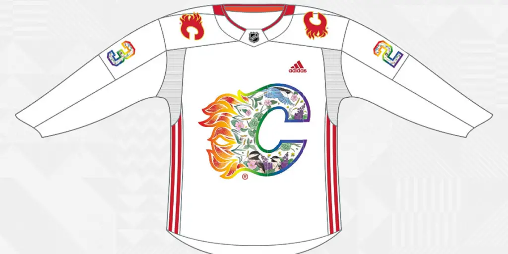
This beautiful jersey designed by Megan Parker is a love letter to Alberta and the queer community within. While it uses the traditional rainbow pallet integrated into the Flames logo, Parker is thoughtful with the way they use it. Flora and fauna native to Alberta can be found arranged within the logo, creating the rainbow in their own way. It’s beautiful, thoughtful, and a unique and distinctly local way to celebrate Calgary Pride.
4. 2022-23 Los Angeles Kings – Mio Linzie
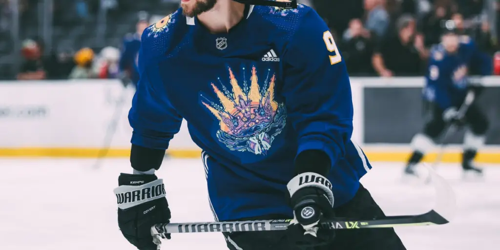
Mio Linzie strikes again with another incredible design, this time for the Los Angeles Kings. This thoughtful piece not only celebrated the queer community but Los Angeles and the community of Kings fans. Harking back to the classic Kings purple, the color pallet integrates light, warmth, and heart. The sun represents change and fluidity, always able to rise again in the morning, the crown evokes power, success, and pride in oneself, and the hands holding everything up show the power of community and unity. Surprisingly, it’s one of Mio’s most simple designs, and yet it’s still able to convey beautiful, strong queer art.
3. 2022-23 Nashville Predators – Landon Matney
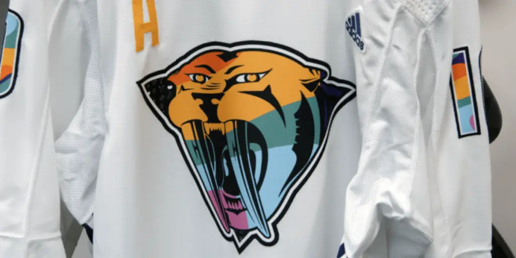
Landon Matney’s jersey created for the Predators is another that expresses queer beauty in more ways than just using the rainbow. Matney wanted to blend the unique Preds aesthetic, old and new, into a whole new hybrid of color and detail. He took the detail of the upsidedown triangle already integrated into the logo and took inspiration from what was once used to identify and shame queer people by the Nazis and then reclaimed in the 70s and 80s as an act of protest. The flow of colors is also unique to each jersey, further symbolizing how the queer experience is different from person to person. There are also plenty of smaller details and finishings that make this jersey such a standout.
2. 2022-23 Vegas Golden Knights – Mio Linzie.
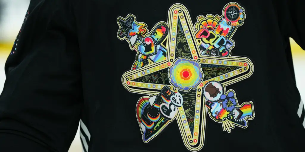
These spectacular jerseys are another product of the incredible Mio Linzie. Mio is able to capture the spectacle of Las Vegas while integrating the queer experience within. They used classic navigation iconography to convey the way the queer community experiences the feeling of being lost and unwelcome, but through each other, they can always find their way home. Mio also digs into clear queer iconography in this piece, being unafraid and prideful of where we’ve been and where we’re going. It’s so extremely Vegas and so extremely queer.
1. 2021-22 Vancouver Canucks – Mio Linzie
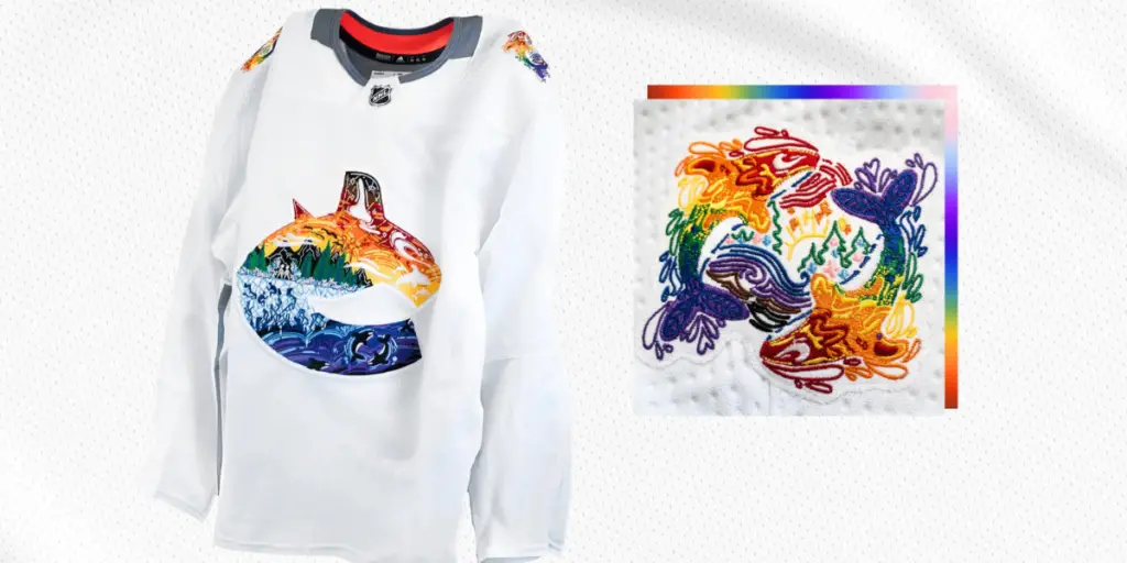
I wasn’t lying when I said Mio Linzie has captured the NHL with their art. This was the first truly unique and thoughtful jersey created for a Pride Night titled The Queer Experience: Sea to Sky. Mio dug deep into the beautiful nature surrounding Vancouver and told a story through it. The Orcas in the deep purples represent the feeling of drowning, but the surrounding community can help free us from those struggles. The ice conveys the feeling of being stuck, like someone who hasn’t come out yet, but once the ice melts, we come out stronger. The forest where two people are surrounded by flowers shows a new path that awaits. The mountains represent what queer people must climb in their lives, it’s not always easy, but the peak is always worth it. The sky conveys the freedom and joy that being queer is and the promise of a beautiful world when we are able to coexist with one another. This thought-provoking jersey is unmatched and tugs at my heart in the best way possible.
Discover more from Inside The Rink
Subscribe to get the latest posts sent to your email.


