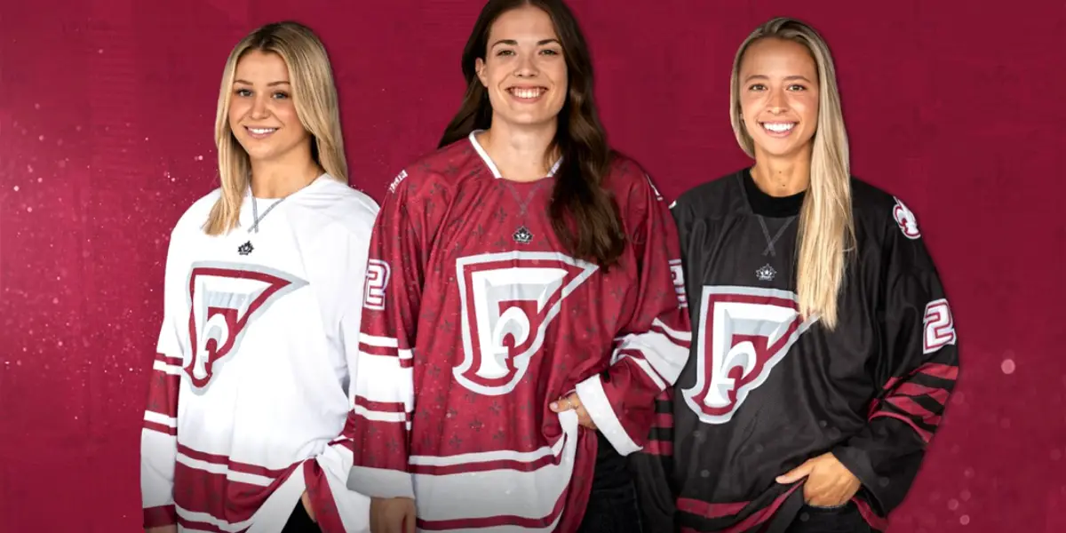
The team in Montreal has a name, Force of Montreal, if directly translated from the french word mark. In the words of team president Kevin Raphaël, from a press conference streamed live on Instagram, “Force of Montreal wants to not only be a force of the ice but a force in the community.”
This morning Force Montreal released not only their name but their colors, logo, jersey, and where they will play this season. Unlike the majority of hockey teams, the Force will not be playing out of only one rink this season, instead they will be playing out of rinks all over the province of Québec as a way of connecting with their new community. The team announced all of this information in a gorgeous video posted to social media.
In my opinion, this jersey is a work of art. The jerseys and the logo were designed in collaboration between Brendan of BRND studios and Lucas Daitchman of LDconcepts. These two designers have worked for the PHF before, and I think that this is some of their best work.
The logo takes inspiration from the Fleur de Lis, which is an emblem of the province of Québec. The motif of the Fleur de Lis is also repeated on the shoulder of the jerseys, as well as a print on the maroon jersey.
The jerseys themselves are things of beauty. I was slightly worried that they would go the route of the former CWHL team and do jerseys that were quite similar to those of the men’s hockey team that also plays out of Montreal, but I was happily wrong. These jerseys still feel like hockey jerseys while doing something new and different from what we have seen before. The attention to detail in the design is truly remarkable. I love the sleeve striping on the white and maroon jerseys.
The influence I could find for these jerseys and the colors of Force Montreal is the Montreal Maroons, a former NHL team that played in the pre-original six era. The tie-ins to that team are there if you know what to look for, especially in the sleeve patterns, but there is a modern twist to these uniforms. The classic and the modern are melded in these jerseys for a breathtaking look. I, for one, can’t wait to get my hands on one of these jerseys.
The team will stand out on the ice compared to the other teams. The PHF teams have done wonderfully, not having color repetition between teams as the NHL does. The teams in this league are not afraid to use non-traditional hockey colors, and the Force is just as bold. Color-wise, the game I am looking forward to the most is seeing the Force play the Beauts. Imagine with me for a moment the Maroon jerseys taking the ice, and against them is the baby blue and black of the Beauts, the colors swirling and skating around each other, the blue and the maroon making a striking contrast as the hockey plays out on the ice.

We try a live draft – Checkin' Tendies
Discover more from Inside The Rink
Subscribe to get the latest posts sent to your email.


